
CUSTOMER STORY / B · UNITED STATES
Customer B: start with an unclear grid line Work the feedback into every part of the target
The grid needed to be clearer, but that was only part of the work. This US target seller also wanted changes to the number, size, pattern and colors of the aiming areas. Following those details shows how a broad design concern became a sequence of questions, revisions and a custom order.
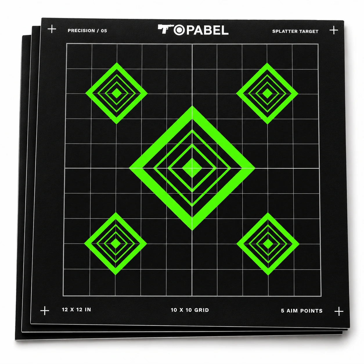
EXISTING CATALOG PRODUCT
Green nested-diamond sight-in targets
This existing 12 × 12 inch product combines a large central aiming area with four smaller corner areas on a gray grid. Its clear hierarchy makes the grid, spacing, shapes and colors discussed in this story easier to see.
TB-SI-ZS-1212-SP-SPL-06
View this product ↗Existing catalog product used as a design reference, not Customer B’s verified final artwork.
- Customer
- US target seller
- Business
- Paper targets & other targets
- Custom order
- Sight-in paper targets
- Design revisions
- Grid clarity & aiming-area layout
01 / Start with the grid
The drawing had a grid. It still needed to read clearly.
The work on Customer B’s sight-in target can be told through a small detail: a grid line. Customer B was a US seller of paper targets and other target products, commissioning a custom batch for its assortment.
The requested work covered grid-line clarity and the number, size, pattern and colors of the aiming areas. These choices affected one another: heavier lines changed the emphasis of the borders, while larger areas changed the space around the grid.
For a seller, the face also has to make sense as a product: the eye should find the key areas, the supporting lines should remain readable and the design should be easy to explain to a buyer. That gave the conversation its practical focus.
02 / Find what was unclear
Before making the lines heavier, find where they disappear
The grid looks present when a detail is enlarged, yet loses definition when the full drawing is viewed. Sending another enlarged screenshot would leave the customer’s concern unanswered.
We brought the question back to the face of the target: which lines were hard to follow, were crossings getting lost, and did the grid compete with the aiming-area outlines?
The design work then became more specific. We reconsidered the contrast of the fine grid, distinguished it from the main reference lines and checked where lines met the aiming-area borders. The next drawing had to show a grid the eye could follow without every line carrying the same visual weight.
When returning the drawing, we could point to the lines under discussion. The customer could judge the revised full face and ask about a particular detail, giving the next exchange a clear starting point.
DESIGN COMPARISON
Same aiming area. A grid that is easier to follow.

The green aiming area stands out, but the faint grid fades into the black background and its intersections are hard to follow.
The aiming area stays unchanged. Clearer gray grid lines and intersections give the surrounding structure more definition.
03 / Rearrange the aiming areas
A change in count affects the space around every aiming area
The grid was only one part of the customer’s feedback. The aiming areas also needed changes in count and size. As those choices changed, the available space around them had to be reconsidered within the complete layout.
This is where a request for a different layout becomes tangible. A larger area can crowd its neighbors; too many equally prominent areas can make the page feel busy. The conversation needs to establish which area should lead and how the others should sit around it.
We reopened the complete layout to consider how the shapes related to one another. The main area and supplementary areas received different visual weights, their spacing was reviewed and the surrounding grid remained part of the check.
A marked detail could explain one adjustment, while a full-sheet proof showed whether the overall arrangement felt more settled. The buyer could compare the proposal with its original intention without having to infer the larger layout from fragments.
04 / Work on pattern and color
The shape can be right while the visual emphasis still feels wrong
Customer B’s confirmed revisions also included aiming-area patterns and colors. Once the layout was being reviewed, those details became another way to ask whether the right part of the design attracted attention.
The issue is the relationship between the center detail, its surrounding shape and the grid. Making every element stronger would leave the buyer with another busy drawing.
The reconstructed revisions simplify competing border detail, bring the strongest color contrast toward the intended focal area and review how the central mark reads within its surrounding pattern. The changes can then be discussed as a few identifiable decisions.
Returning to the whole face remains important: a clear detail still has to work within the revised count, sizes and spacing of the aiming areas.
DESIGN COMPARISON
The same diamond design, with changes in count, color and size
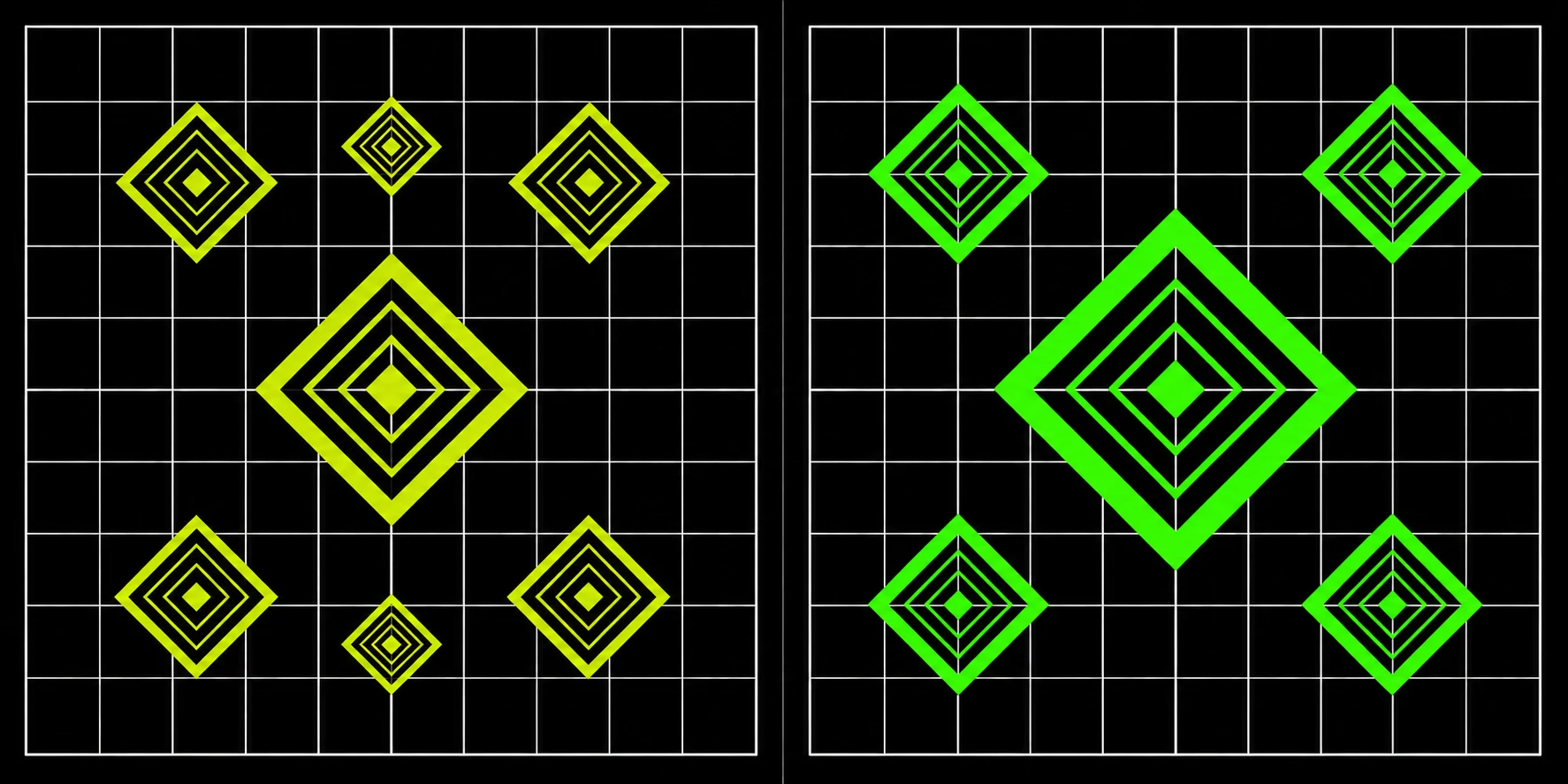
Seven yellow-green aiming areas in a symmetric layout: a smaller main diamond, four corner areas and two small auxiliary areas at the top and bottom.
Five vivid green aiming areas: remove the two small auxiliary areas, enlarge the central diamond and retain the symmetric four-corner layout.
05 / Make each response visible
The next drawing came with an explanation of what changed
With grid lines, area count, size, pattern and color all under discussion, an unexplained new file would make the customer hunt for changes. Each response travels with a short set of marked changes.
One note points to the grid-line treatment. Another identifies the rearranged aiming areas. Another explains the pattern and color work. The complete proof remains beside the details, so the buyer can review both the changes and their combined effect.
The drawing also needs to preserve what has already been settled. As a later layout is revised, earlier grid improvements should remain part of the reference. Keeping that continuity makes the conversation easier to follow.
06 / Bring it to the printed sheet
The sample review follows the same questions raised in the conversation
The sampling part of this story follows the questions already established: do the lines print clearly, do the areas match the intended arrangement, and do pattern and color retain the relationships discussed on screen?
A useful check moves between the full sheet and its details. Grid crossings can be inspected closely, then the complete target can be viewed again for the relationship between the aiming areas. The artwork and sample need to carry the same revision reference.
If a printed line remains hard to follow, its location can be marked and checked against the drawing. Color comments can be recorded separately. Linking a comment to a specific detail gives the next revision a clear direction.
07 / From revisions to trust
The buyer could see its feedback in the design
Customer B commissioned a batch of custom sight-in paper targets. Looking back through the design work gives that order a more concrete story: grid clarity was improved, and aiming-area count, size, pattern and colors were adjusted.
Trust has an identifiable basis here. The buyer can connect a concern with a question, a question with a revision, and that revision with the next drawing it reviews. It can see how its feedback has been understood and carried forward.
A grid line became clearer. A crowded relationship was reconsidered. A pattern and its colors were revisited together. Those are the details that make the path to this custom order easier to follow and remember.
YOUR CUSTOM PROJECT
Which part of your target still needs work?
Send the drawing and mark the details you want to change. Grid lines, aiming-area count, sizes, patterns and colors can be reviewed together before the next drawing is prepared.
Want to try a design of your own? Start with a template and its available editing options, or ask our team for help.
The workspace supports English and Chinese. Editable options vary by template. Drafts stay in this browser; email or WhatsApp a screenshot to our team. Saving a draft does not submit an inquiry.