
TOPABEL KNOWLEDGE SERIES / 09
Why does the colour look different on screen, in photos and on paper?
A display emits light, printed paper reflects the light around it, and a camera records an interpretation of that scene. Display settings, camera settings, lighting, ink and paper can all change the appearance of the same design.
Store and inspect · About 3 min read
Compare the same patch in three places
The main swatch represents the same area of a design in all three panels. Look at the green patch, the three grey patches below it and the surrounding white area. In the phone photo, the warm lamp changes the appearance of the entire sheet. The colour shifts in the illustration are exaggerated so you can see what changes together.
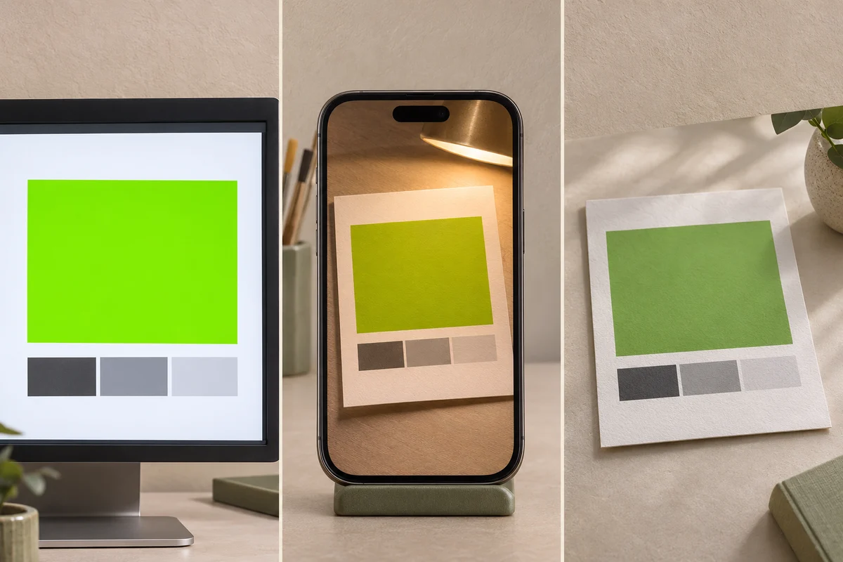
- Screen preview · emitted light
- Phone photo · capture and processing
- Printed proof · reflected light
AI-generated illustration. Colour shifts are exaggerated for comparison.
Identify where the change enters
Display brightness and colour mode affect the preview. Exposure and white balance can make a phone image brighter, warmer or cooler. On a physical sample, paper colour, ink and surface gloss change how light is reflected. If a colour moves as you tilt the sheet, note the viewing angle and look for glare.
Record a comparison your supplier can repeat
Place the reference and sample side by side under the same stable light. Identify the exact area, describe the difference and record the sample and artwork revisions. If you send a photo, put both pieces in the same frame and record the light source. For approval, agree on the physical reference and viewing conditions with the supplier.
Quick questions
Can I approve print colour from a phone photo alone?
A photo helps locate and describe a difference. Use an agreed physical proof under consistent lighting when colour approval matters.
What should I write beside a comparison photo?
Include the sample and reference versions, the area being compared, the lighting and the direction of the difference.